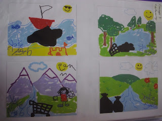
For my chosen stamp design I have chosen to go with the child like drawings.
I feel they give a clear message and fit all the criteria of the brief primarily in educating the next generation for a stronger future as they catch the eye of children as well as parents or teachers who will then teach the children about the problem of water pollution. I also think there is a visual distinction between the 4 stamps as they are all different but they still work as a set being in the same style.
From the initial idea I developed it more by creating it in paint on the computer instead of pencil. I think this is clearer, gives continuity and makes it easier to format electronically.
I than began to think about the typography and monetary value that have to be included on the stamp. As I had already chosen Calibri (body) as the font to use, placement was the next port of call. It was between straight across the top or in a vertical list. I chose the vertical list but to fit it onto the top left corner of the stamp.
So here is my final stamp design, in A5 and actual stamp size, for the Visual Communications brief ; World with a Future :
I placed it on small envelop to see if it functioned correctly. I think it works in the small size and stands out on the small white envelope :
During my research I found out stamps come in small booklets when purchased in multiples. Using the current definitive stamp collection booklet as a template, I made a mock-up of a possible booklet for my stamp set :
I have really enjoyed this project. I have always been interested in environmental issues so this was a great way to explore it in another light. Looking at stamp design was different as well as it is such a defined area though is wasn't restrictive as it possible to be innovative and creative on a small canvas. A typography project is next and I'm looking forward to seeing what that entails!


No comments:
Post a Comment